Step by Step

Visions of an Art Dealer’s Collection

Step by Step is the result of a remarkable collaboration between the Nouveau Musée National de Monaco and Italian collector Fabrizio Moretti. Highlighting Moretti’s collection, this volume reveals surprising links between ancient works of art and the thoughts of the collector.

“The knowledge that Moretti has of the past is profound but unnatural. His relationship with contemporary works of art is direct. His collection reveals fascinatingly the inner conflict of a collector who wants to make schizophrenia of taste part of his identity. In Fabrizio Moretti, the Dr. Jekyll of old art and the Mr. Hyde of contemporary art coexist.”
– Francesco Bonami

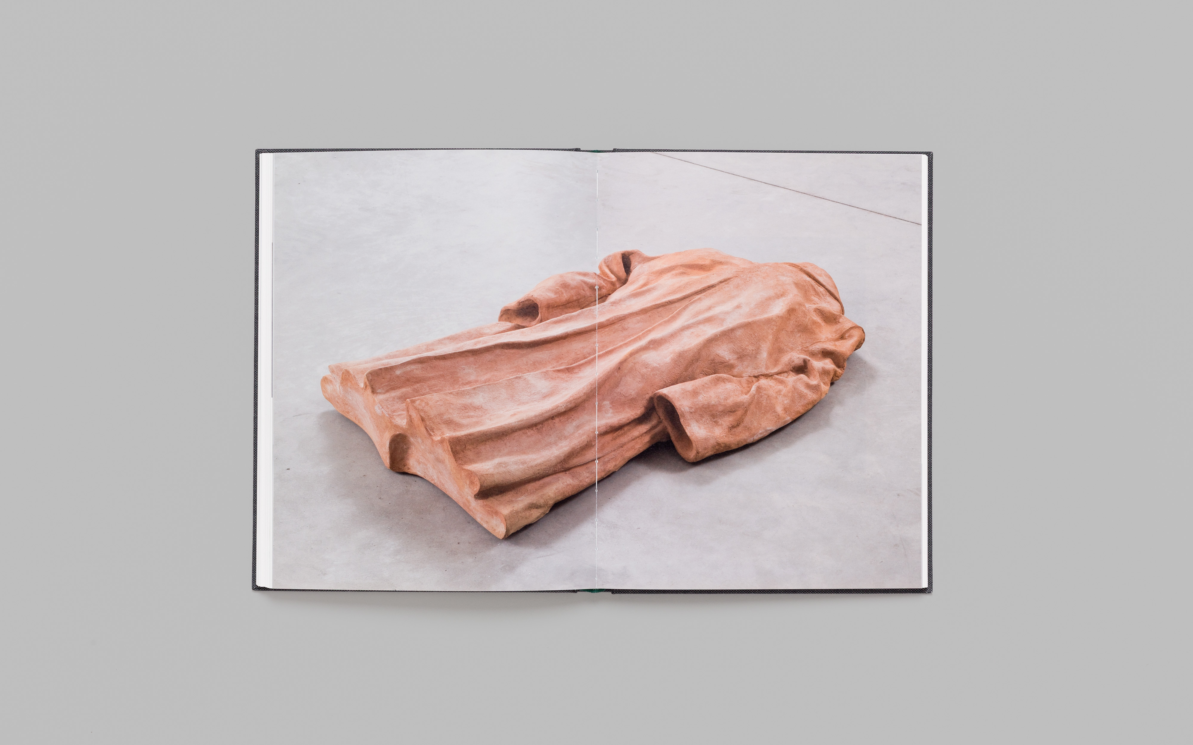
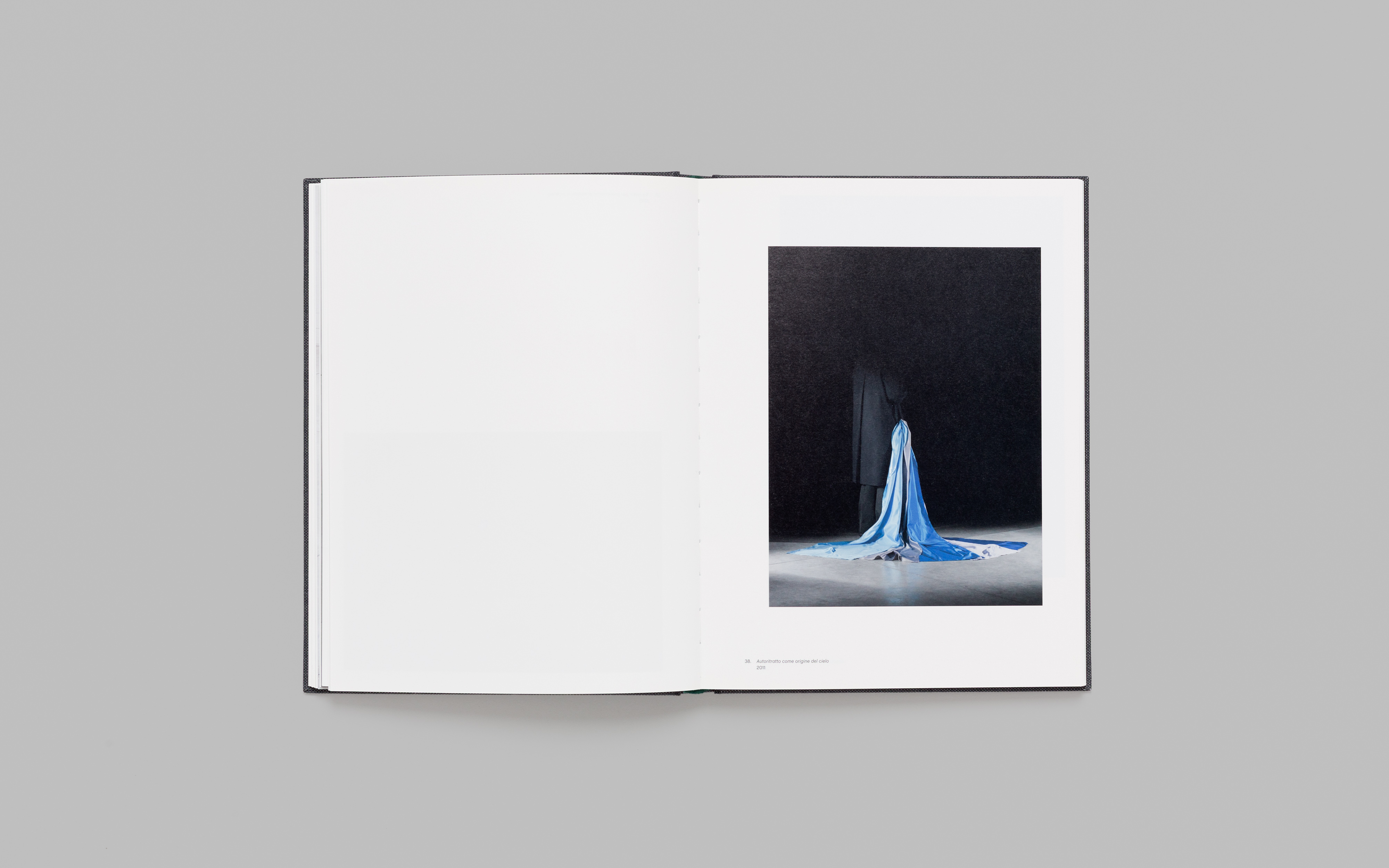
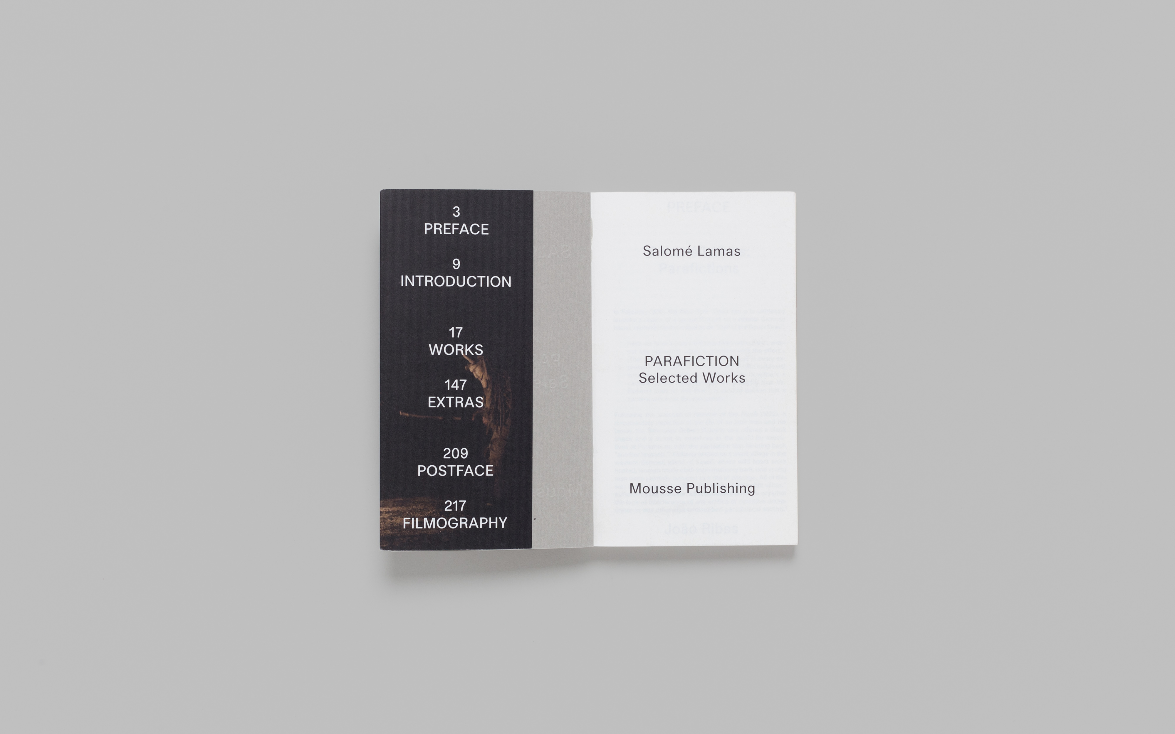
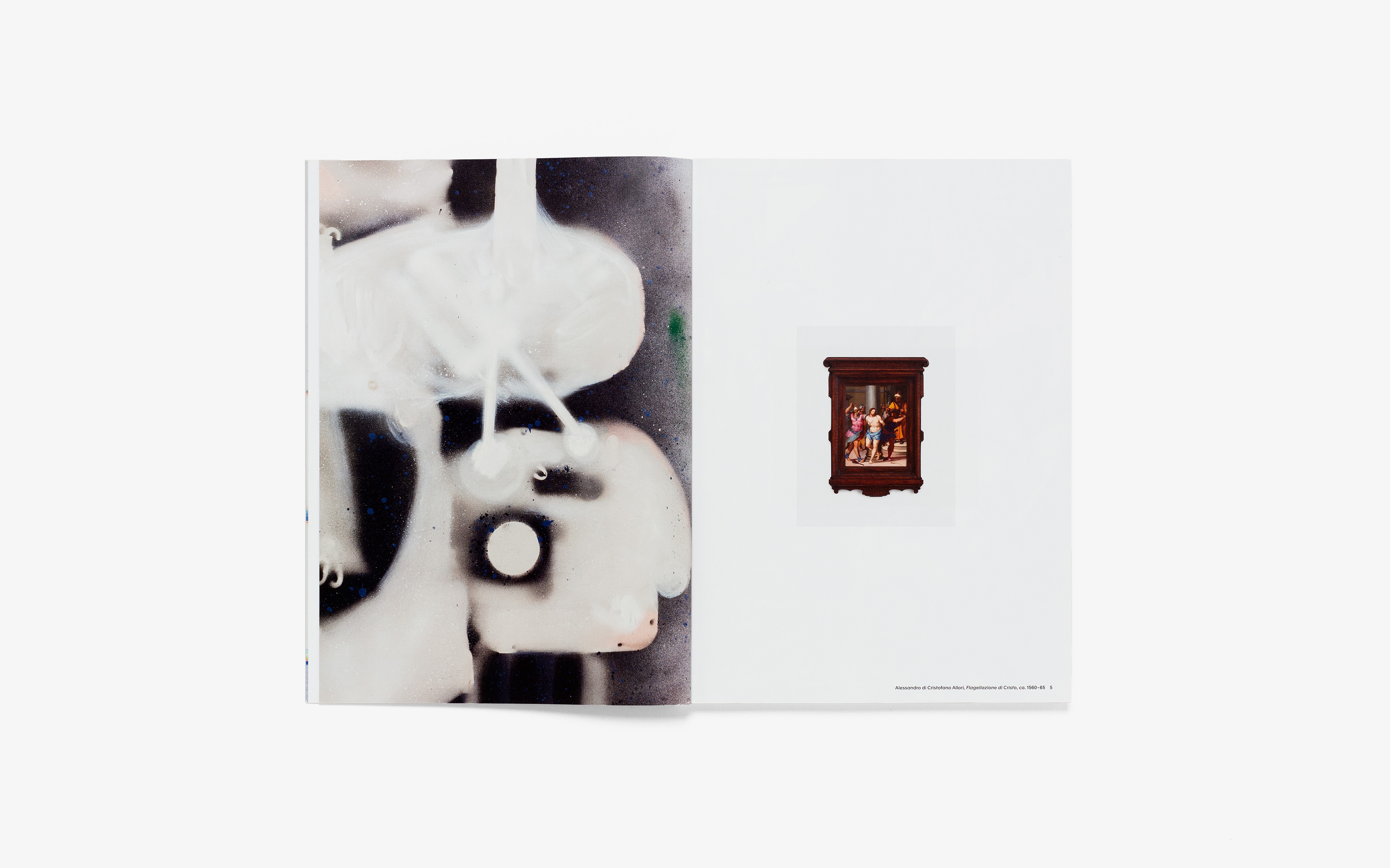
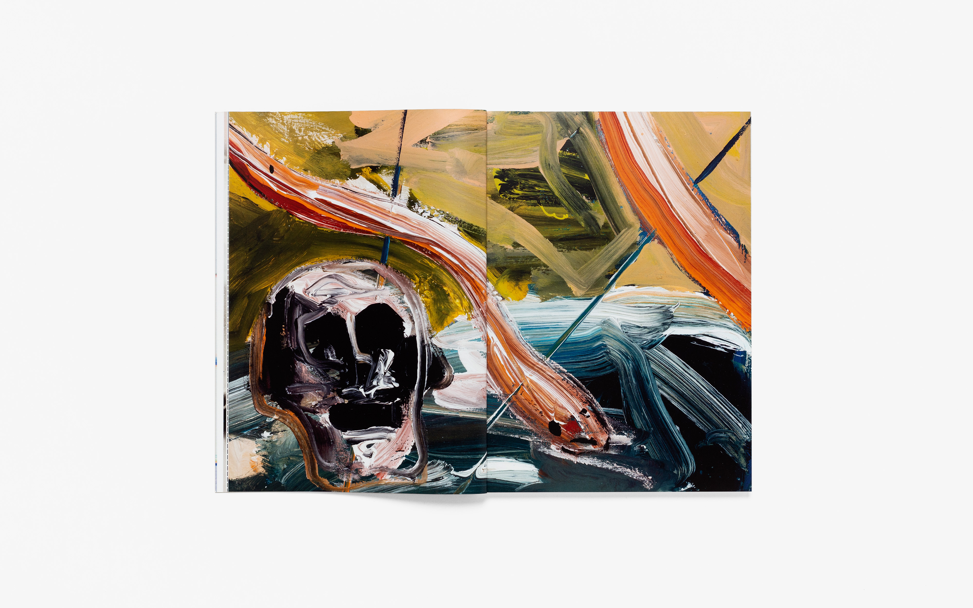
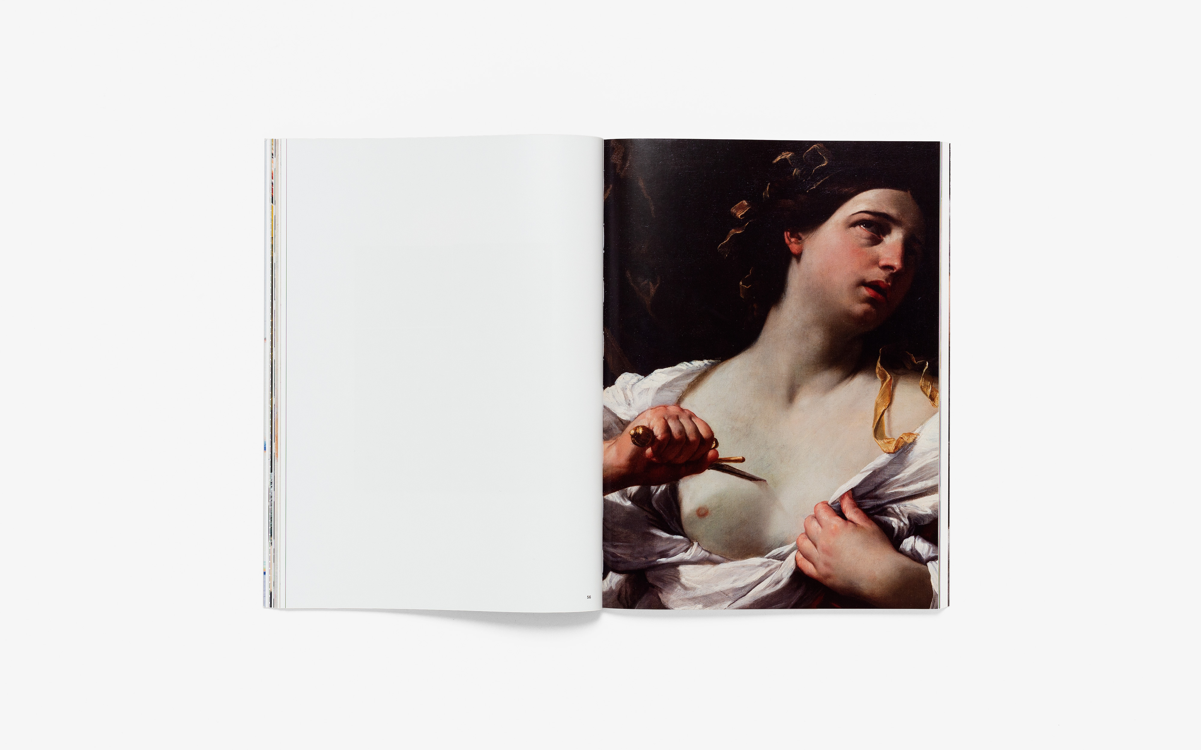
Published following the eponymous exhibition curated by Cristiano Raimondi at the Nouveau Musée de Monaco – Villa Sauber in 2020 and featuring Fabrizio Moretti’s private collection, Step by Step represents a journey through Western artistic culture, from the Gothic period to the experiments of the last ten years, passing through Mannerism and the Baroque. Focusing on the intrinsic beauty of their nature as objects, and following a non-linear sequence that allows past and present to question one another, the book reveals new and unexpected similarities between works of art as far ago as the fourteenth century and those from the present day. Texts by Francesco Bonami, Tommaso Montanari, and Cristiano Raimondi. Published by Mousse Publishing.

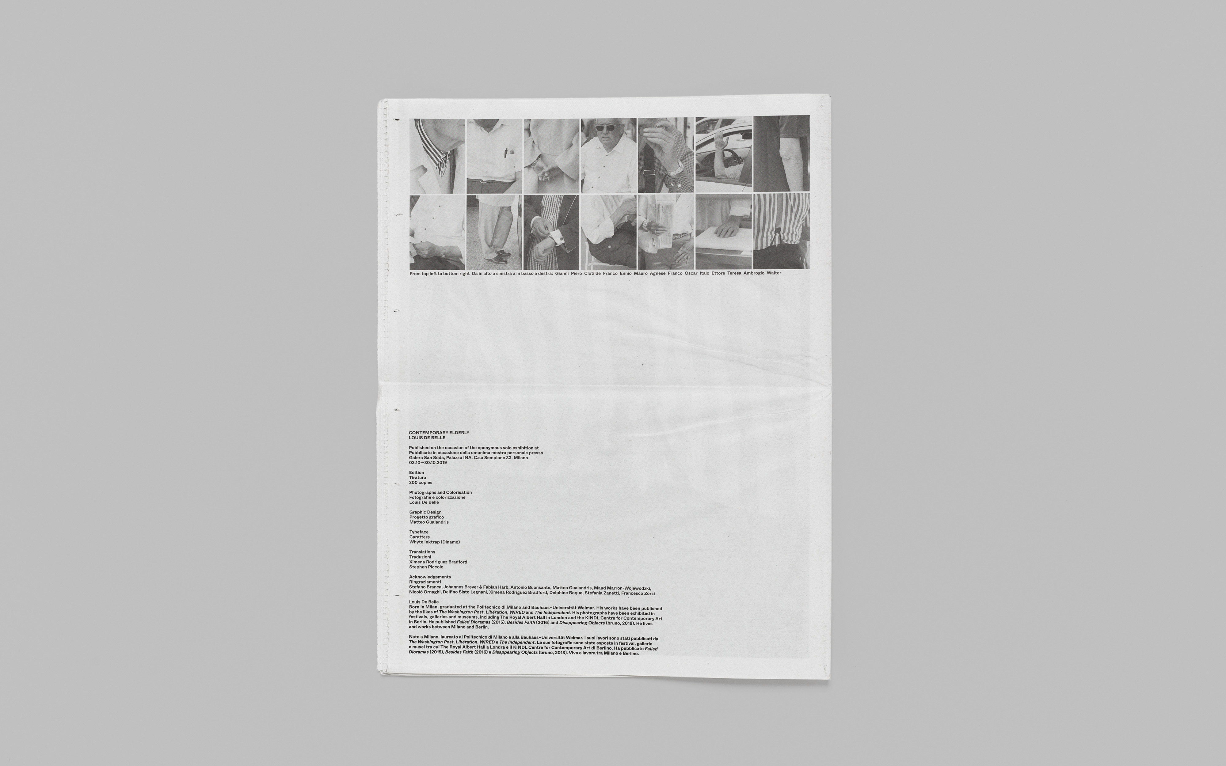
240 × 330 mm, 164 pp.

Robert Morris

The Perceiving Body

During the 60s and 70s, Morris produced what are now considered to be canonical works of Minimal and Postminimal art. Robert Morris. The Perceiving Body accompanies the monographic exhibition curated by Jeffrey Weiss at Mudam Luxembourg – Musée d’Art Moderne Grand-Duc Jean in 2020.

This book, co-published by Mousse Publishing, Mudam Luxembourg, and MAMC+, accompanies the eponymous exhibition of the work of Robert Morris (1931–2018), a foundational figure in the history of Minimalism, Postminimalism, and Conceptual art. The exhibition curated by Jeffrey Weiss at Mudam, focuses on the role of installation and the phenomenology of direct encounter in Morris’ work of the 1960s and 1970s, foregrounding the relationship between the sculptural object and the beholder in the space of the room. This volume contains texts composed from three vantage points: art-historical essays by Jeffrey Weiss, Caroline A. Jones, and Courtney Fiske; personal accounts by dancer Simone Forti and curator and critic Bernard Ceysson; and three essays by the artist himself address certain fundamental preoccupations of sculpture after 1960: medium, form, space, and time.

220 × 280 mm, 222 pp.

Never Again

Diego Tonus Elisa Caldana

On a film cycle’s unlikely inspirations from post-truth storytelling, found CGI films, and Peter Zumthor. This publication includes images and research related to the making of the works by Italian duo Tonus Caldana, and it brings together written contributions from various authors.

Never Again revolves around the cycle Topography of Terror, initiated by Italian artists Elisa Caldana and Diego Tonus in 2017, and presents the making-of process behind Topography of Terror and Never Again, the first two episodes of the cycle. These two films involved the CGI making of the never-realized building Topographie des Terrors, in Berlin, by Swiss architect Peter Zumthor, and research on the effects of violent imagery in terrorism spreading through news and social media. The book, published by Mousse Publishing, also comprises written contributions from Charles Esche, Gareth Evans, Mark von Schlegell, and Emanuele Guidi, all instigated by the films and their main themes, such as post-truth and journalistic storytelling.

225 × 155 mm, 162 pp.

Gianni Pettena 1966–2021

Monograph

The first book to cover the entire span of Gianni Pettena’s career. Pettena was a central figure in the Italian Radical Architecture movement in the 1960s and 1970s. His multimedia works are collected in this extensive monograph published by Mousse Publishing.

Gianni Pettena (born 1940, Bolzano, Italy) was a central figure in research regarding the boundary between architecture and art in the later 1960s—a movement Germano Celant dubbed “radical architecture.” Together with the Florentine groups Archizoom, Superstudio, and UFO, and Turinese groups like the Gruppo Strum, Pettena helped expand and redefine the limits of what could be described as architecture, making a fundamental contribution to the ferment that animated, at an international level, city planning debates in those years. Pettena took an anarchic and ironic attitude toward authority, whether exercised in politics, progress, or planning. Through an extraordinary variety of means, including installation, performance, photography, video, and design, he has remained “on a strikeout of his love of architecture” for more than fifty years. Rather than practice the discipline, he has chosen to challenge it through the language of art, critical and expository writing, and the medium of teaching.

A series of focused and in-depth studies and a rich and exhaustive set of illustrations accompany this volume. While the division into themes that gives the book its structure follows the detailed analysis carried out by the authors and servers to highlight possible recurrent areas of research in Pettena’s work, above and beyond any chronological and formal articulation, the other essays concentrate on more specific aspects of his practice. Edited by Luca Cerizza and published by Mousse Publishing. Texts by Gianni Pettena, Stefano Pezzato, Christiane Rekade, Elisabetta Trincherini, and a conversation between Gianni Pettena, Luca Cerizza, and Hans Ulrich Obrist.

240 × 320 mm, 288 pp.

Second Yinchuan Biennale

Starting from the Desert. Ecologies on the Edge

Visual identity and publishing projects designed to accompany the Second Yinchuan Biennale, curated by Marco Scotini and held from June 9 to September 19, 2018, at MOCA – Yinchuan Museum of Contemporary Art.

The Second Yinchuan Biennale, curated by Marco Scotini and held from June 9 to September 19, 2018, extended over 15,000 square meters of museum space of MOCA Yinchuan, the surrounding Hui Nongque Ecopark, and the International Artist Village of the River Origins. The exhibition articulated itself through four thematic sections: Nomadic Space and Rural Space, Labor in Nature and Nature in Labor, The Voice and The Book, and Minorities and Multiplicity. In keeping with the concept proposed by the curator, the visual identity revolves around the Tengger Desert and its topographies: tangible yet in continuous movement, impermanent.

Poster: 700 × 1000 mm

LaToya Ruby Frazier

Monograph

This publication offers a profound insight of the practice of Pennsylvanian artist LaToya Ruby Frazier focusing in particular on three photographic series. The book was published by Mousse Publishing in conjunction with the solo exhibition that Frazier held at Mudam Luxembourg in 2019. Winner of the 2020 Kraszna-Krausz Foundation Book Awards.

Since the early 2000s, Frazier has developed a documentary practice that is both personal and engaged with the US social and political realities. At Mudam Luxembourg, the artist presented the emblematic photographic series The Notion of Family, developed between 2001 and 2014, witnessing the decline of her hometown of Braddock, the former steel capital of Pennsylvania, with two more recent bodies of work, namely On the Making of Steel Genesis: Sandra Gould Ford (2017)–the outcome of a close collaboration with photographer Sandra Gould Ford–and Et des terrils un arbre s’élèvera (2016-2017), an ambitious project near Mons, Belgium, that involved former miners and their families.

The book, published in English with translations in French, features works from the three series, a conversation between Frazier, Christophe Gallois (Curator, Mudam Luxembourg), and artist Claire Tenu, and an essay by contemporary art historian Elvan Zabunyan.

LaToya Ruby Frazier won the 2020 Kraszna-Krausz Foundation Book Awards.

230 × 330 mm, 176 pp., Mousse Publishing

Photoset: Barcelona® Day Bed, Ludwig Mies van der Rohe (1929), Knoll

Contemporary Elderly

Louis De Belle

Visual identity and newspaper designed to accompany the exhibition Contemporary Elderly by Italian photographer Louis De Belle held at Galera San Soda Milan in 2019.

Contemporary Elderly is a series of colorised photographs of older people shot in the streets of Milan. An insight into the status of senior citizens in modern times, through close-up crops on postures, clothing details, and specific gestures, emphasised by the selective process of colorisation.

Matteo Gualandris was commissioned by photographer Louis De Belle to develop the exhibition identity and the catalogue, a bilingual tabloid size publication which features all the artworks on display at Galera San Soda and a preface by Maud Marron-Wojewodzki (Musée Fabre, Curator), which reads: “Along the streets of Milan, Contemporary Elderly captures the quite signals of an aged group banned from the spotlight. Under the scrutinizing gaze of Louis De Belle, gestures and objects satured by time seem to materialize in concrete, self-contained realities: revealing the symbolism hidden behind their mere appearance as photographic images, these involuntary, calculated or casual details that set the tone of an entire generation display their emblematic nature. An approach emphasized by the technique of the close-up and large-format prints, whose uniform character contributes to grant a serial perspective to the whole.”

Catalogue: 290 × 380 mm, 32 pp.

How Evil Is Pop Art?

Collezione Olgiati

Identity for the exhibition How Evil Is Pop Art? New European Realism 1959-1966 curated by Tobia Bezzola at Collezione Giancarlo e Danna Olgiati Spazio -1 Lugano, 2018. The campaign included poster, wayfinding, outdoor advertising, invitations, digital collateral, and an accompanying catalogue published by Mousse Publishing.

“Tullia Zevi’s question ‘How evil is Pop Art?’ posed in her 1964 review of the Venice Biennale, neatly summed up the moral indignation of the times with which large parts of the audience viewed this new form of art. Pop was not simply just another ‘-ism’ in the established tradition of the avant-garde, and it was not a style either. Pop was the new, iconoclastic statement of a young generation of artists, breaking for the first time since the Dadaists with fundamental premises of modern Western Art.”
–Tobia Bezzola

The exhibition, curated by MASI Director Tobia Bezzola, stemmed from the desire to re-read the European Pop phenomenon via a sophisticated selection of works thanks to the encounter between two private collections. With forty-two works, all executed between 1959 and 1966, the show offered a surprising view of the artistic languages that, notwithstanding differences and similarities, were simultaneously formed in France, Great Britain, Italy, and Germany: paintings and sculptures that represented the finest result of European Pop Art showed how in these countries a new artistic sensitivity was articulated, one that, in the richness of the formal language and the breadth of the contents, could be compared to American Pop Art.

The visual identity—designed at Mousse and co-art directed with Massimiliano Pace—is centered around an image-focused campaign developed on the reinterpretation of Kondrad Lueg’s Cassius Clay (1964), one of the paintings on view. This image has been employed as a recurring element across all media.

Catalogue: 230 × 330 mm, 144 pp., Mousse Publishing

Nick Darmstaedter

Monograph

The book celebrates the work of New York-based contemporary artist Nick Darmstaedter, whose practice involves a wide variety of media and methodologies to create paintings, installations, and sculptures. This is his first monograph.

Nick Darmstaedter produces artworks without an affinity to a single medium. He is best known for his involvement with the artist-led organization The Still House Group, founded in 2007. He frequently produces works that employ found objects; gathering and sorting are a crucial part of his practice, in which chance also plays a significant role. His works, however, are not readymades, but transformations that emphasize the materials’ physical properties and original forms. Darmsteadter’s works nod to the American Pop and Minimalist movements. The book includes texts by Edoardo Gnemmi and Jens Hoffmann, offering an exhaustive view of the artist’s production.

The iconic exclamation-point-cover is a decontextualization of Darmstaedter’s Hallogallo (2014), an oil painting inspired by the front cover of Neu!, the 1972 debut album by German krautrock homonym band. The book closes with installation views of T2MamaTambien, the first-ever solo Italian exhibition by Darmstaedter, which took place at T293 Rome in 2015. Designed at Mousse.

200 × 285 mm, 128 pp., Mousse Publishing

City Making. Trouble Making

BASE Milano

Identity, campaign, printed matter and exhibition graphics for Trouble Making. An Exhibition on Mass Phenomena and Virtual Networking Shaping our Cities, a group show curated by Raumplan for BASE Milano within the context of the Milan Design Week 2018.

In a time when the discipline of city planning is increasingly beleaguered, who arts the players and what are the processes that really “make a city”? This is the question addressed to the authors of the works that constitute the exhibition. The answers articulate different interpretations elaborated upon six themes that involve the urban dimension. The contributions shown examine the impact and consequences of the huge flows of capital data, goods and tourism on the city and its people’s lives. Apparently, the independent phenomena that run in parallel—home sharing, mass tourism, the internet of things, advanced logistic and gig economy—seem to converge in a cohesive economic model which in turn shapes the urban and domestic spheres. The conflict between flows and places, virtual and real worlds, planning and proliferation is redefining the cities by changing environments, power balances and the way people interact within the city itself.

Matteo Gualandris co-art directed the exhibition identity with Giga Design Studio and was responsible for a poster and digital campaign focused on photographs by Delfino Sisto Legnani, as well as printed matter and wayfindings within the ground floor of BASE Milano, where the exhibition was held during the Milan Design Week 2018.

Francesco Gennari

Monograph

Developed as a reference monograph, the first to be published about the Italian artist Francesco Gennari, this volume offers insights into the artist’s body of work—composed of sculptures, drawings, and installations—coherently spanning the last twenty years of his artistic practice.

Francesco Gennari is one of the most representative Italian artists of his generation. His is an imagination with scientific and philisophical traits. Void is Gennari’s sphere of work, the realm of his quest. He shapes it, makes it tangible, taking the audience directly into the non-metaphoric anthropomorphism of his work. Since the start of his career, the artist has shown steadfast consistency in formalizing his thoughts in sculpture, creating a significant œuvre.

Edited by Alberto Salvadori and published by Mousse Publishing on the occasion of Francesco Gennari’s solo exhibition at Museo Marino Marini, Florence (2015), the book includes an anthology of works selected by Gennari documenting every series he has worked on and developed from the beginnings of his artistic journey. A selection of unpublished essays by Xavier Franceschi, Julian Heynen, Simone Menegoi, Alberto Salvadori, and Dieter Schwarz further elaborates the systems operating in the living structures created by the artist. Designed at Mousse.

210 × 285 mm, 256 pp., Mousse Publishing

Connecticut

Long-Life Doors

Identity, art direction, a system of catalogs, and stationery for the leading Italian company in the field of functional doors operating since the 1950s. The work extends to the design of a new website that represents the entire Connecticut product line. In collaboration with Studio FM Milano.

Established in 1955 during a research project for the processing of plastic and synthetic resins conducted by Montecatini Edison, Connecticut immediately became a leader in the field thanks to its innovative technologies and materials, which were absolutely revolutionary for the time. From 1960s to date the company focused on this production and progressively widened its range to include new materials and designs, covering all kinds of aesthetic and functional requirements in every area, becoming the most important Italian firm specialized in the production of interior doors for non-residential buildings.

Working closely with the company’s owners, the original 1950s identity has been substituted by a full rebranding and a comprehensive brand system which includes a new logo, bespoke wordmark, and pay-off along with stationery, print collaterals, catalogues, website and art direction. A formal severity emphasizes the technical strictness of Connecticut’s products across all these media. The shooting of doors and accessories involved photographer Giuseppe Brancato and interior stylist Chiara Di Pinto. Designed at Studio FM Milano.

Catalogue: 200 × 297 mm, 88 pp.
Photography: Giuseppe Brancato
Styling: Chiara Di Pinto

Tommaso Lucinato

Strutture Auxetiche

Publication presenting the research outcome and test results of the ongoing Industrial Design Laboratory at UniSRM Design, University of the Republic of San Marino. It focuses on auxetics structures and includes an essay by professor Tommaso Lucinato and an exhaustive photographic documentation of geometric models.

Marked by a peculiar vertically stressed size, smart binding, and overall lightness and handiness, the book has been developed closely with the author, professor and product designer Tommaso Lucinato, whose illustrated essay on auxetic’s scientific background introduces a black and white report of auxetic 3D models, output of the workshop held at UniSRM. Strutture Auxetiche has been designed in collaboration with Davide Di Gennaro, co-founder of Tomo Tomo.

Auxetics comprise a rare family of materials that manifest negative Poisson’s ratio, which causes expansion, instead of contraction, under tension. The most known homogeneously auxetic materials are porous foams and artificial macrostructures; there are also a few examples of inorganic materials that exhibit this behavior. Such materials are expected to have mechanical properties such as high-energy absorption for lighter and thinner components, fracture resistance, and better conformability for comfort and support. Auxetics may be useful in applications such as body armor, packing material, knee and elbow pads, running shoes, and robust shock-absorbing materials.

130 × 240 mm, 40 pp.

Cortesi Gallery

London Milan Lugano

Visual identity for Cortesi, a Swiss modern and contemporary art gallery with exhibition spaces in Lugano, London, and Milan. The gallery undertakes and develops research activities with an exhibition agenda dedicated to Italian and international artists from the twentieth century, with a look at the contemporary art world.

Founded in Lugano in 2013 by the Cortesi family, the gallery focuses on European artistic movements from the 1960s to present day. It has rapidly become a meeting ground for collectors, scholars, and art lovers, and a bridge between the cultural world and the market. Its activity is characterized by a conscious effort to produce relevant displays with the collaboration of specialists in the field such as external curators, researchers, artists’ archives and foundations.

In addition to its Ticinese headquarter on the Lugano lakeshore, Cortesi opened a new space in Mayfair, London, in 2015, and its third space in 2017 in Porta Nuova, Milan’s most futuristic district. Represented modern and contemporary artist include Vincenzo Agnetti, Agostino Bonalumi, Heinz Mack, Ivan Picelj, Paolo Scheggi, Enrico Castellani, Lucio Fontana, Ugo Mulas, Otto Piene, Dadamaino, Louise Nevelson, Gianfranco Pardi, Günther Uecker, Alighiero Boetti, Walter Leblanc, Hank Peeters, Arnoldo Pomodoro, Chiara Dynys, Maurizio Donzelli, and Angela Lyn.

The visual identity is a rigorous, manageable and elegant typography-based system that makes use of Christian Mengelt’s typeface Unica77 to exemplify a strong Swiss heritage. It applies homogeneously to printed matter, stationery, site specific and digital collaterals as well as catalogues, brochures, invitations and wayfindings accompanying each shows. Designed at Mousse.

Salomé Lamas

Parafiction. Selected Works

Among Portugal’s most interesting filmmakers, Salomé Lamas explores the boundaries and circumstances of documentary filmmaking. This publication chronicles her work since 2010 through contributions, video stills, interviews, and scripts.

Salomé Lamas’ short films and video installation—powerful portraits, in a sense—investigate the traumatically repressed, the seemingly un-representable, and the historically invisible, ranging from the horrors of colonial violence to the landscape of global capital. This fully black and white book, published by Mousse Publishing, covers Lamas’s selected works from 2010 to 2016, and includes contributions by Michael Bobick, Deirdre Boyle, Filipe Felizardo, Irene Flusner Pimentel, Peter Galison, Javier H. Estrada, James Lattimer, Joana Pimenta, João Ribas, Lawrence Weschler, and Ana Jotta, as well as interviews conducted by Nuno Lisboa, Jorge Mourinha, and Monica Saviron. Designed at Mousse.

130 × 210 mm, 224 pp., Mousse Publishing

Matteo Gualandris is a Milan-based designer whose work focuses on art direction and editorial design, while also developing visual identities and digital projects for brands, institutions, and private clients. In addition to his freelance practice, he is currently a senior designer at Mousse Magazine, Publishing & Agency, a studio specialized in identities, printed matter, catalogs, and books for the contemporary art world. He previously worked as a designer at Studio FM Milano, where he managed projects for leading international firms in the fields of architecture, culture, design, and couture. Graduated from the Polytechnic University of Milan – School of Design, he teaches Publishing Design at IED European Institute of Design in Milan; he has previously taught at NABA New Academy of Fine Arts and lectured at SPD Polytechnic School of Design. Over the years, the work of Matteo Gualandris has been widely reviewed on various magazines, blogs, and feeds such as Arcademi, Back Catalogue, Bench, It’s Nice That, Ligature, Mirador, SwissPosters, among others.

Get in touch for job inquiries and more information:

info@matteogualandris.com
+39 338 547 37 48

Via Sebastiano del Piombo 22
20149 Milan, Italy

Instagram
LinkedIn
Twitter

Development: Giga Design Studio
Photography: Louis De Belle